A chart is a perfect tool to present data in an understandable way. But sometimes it sucks because we overload it with data. Yes, you heard it right.
I believe that when it comes to charts it should be neat and clean and the best solution to this problem is using interactive charts. By using interactive charts in Excel, you can present more data in a single chart, and you don’t even have to worry about all that clutter.
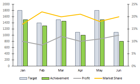
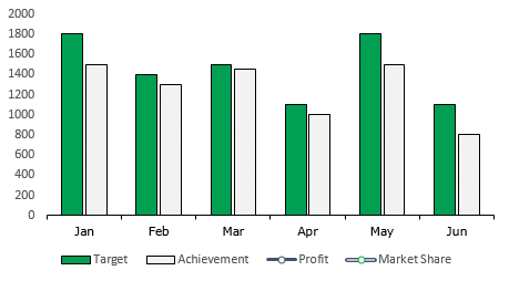
It’s a smart way. Look at the below chart where I am trying to show target vs. achievement, profit, and market share.
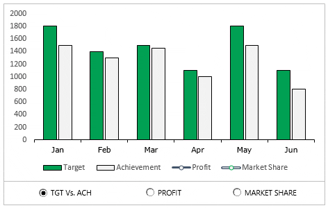
Do you think this is a decent way to present it? Of course not. And now check out this, where have an interactive chart which I can control with option buttons.
What do you think? Are you ready to create your first interactive chart in Excel?
Steps to Make an Interactive Chart in Excel
In today’s post, I’m going to show you the exact steps which you need to follow to create a simple interactive chart in Excel. Please download this file from here to follow along.
1. Prepare Data
- First of all, copy this table and paste it below the original table.

- Now, delete the data from the second table.

- In the Jan month cell of target and achievement, insert the following formulas and copy those formulas into the entire row (Formula Bar).
=IF($A$1=1,B3,NA())
- After that, into the Jan month of profit and copy it into the entire row.

- In the end, Jan month of market share copy it into the entire row.

Your interactive data table is ready.
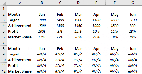
All the cells in this table are linked with A1. And when you enter “1” in the A1 table will show you data for target and achievement only. For “2” it will show profit and market share for “3”.
2. Insert Option Buttons
- Go to developer tab ➜ Control ➜ Insert ➜ Option button.

- Insert three option buttons and name them as following.
- Button-1 = TGT Vs. ACH
- Button-2 = Profit
- Button-3 = Market Share

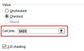
- After that, right-click on any of the buttons and select “format control”.

- In format control options, link it to the cell A1 and click OK.
- Now, you can control your data with these option buttons.

3. Insert Secondary Axis Chart
- First of all, select your table and insert a column chart.
- After that, select your data bars & click on “change chart type”. Go to Design Tab ➜ Design ➜ Change Chart Type.

- Now for profit and market share, change the chart type to the line with markers and tick the secondary axis for both.

Congratulations! your interactive chart is ready to rock. You can also make some formatting changes to your chart if you want.
Sample File
Download this sample file from here to learn more.
Conclusion
In the end, I just want to say that with an interactive chart you can help your user to focus on one thing at a time.
And you can save a lot of space in the dashboards as well. Sometimes you feel that it’s a lengthy process but it’s a one-time setup that can save you a lot of time. I hope this tip will help you to get better at charting, but now, tell me one thing.
What kind of interactive charts do you use? Share with me in the comment section, I’d love to hear from you, and please don’t forget to share this tip with your friends, I’m sure they will appreciate it.
More Charting Tutorials
- How to Add a Horizontal Line in a Chart in Excel
- How to Add a Vertical Line in a Chart in Excel
- How to Create a Bullet Chart in Excel
- How to Create a Dynamic Chart Range in Excel
- How to Create a Dynamic Chart Title in Excel
- How to Create a Sales Funnel Chart in Excel
- How to Create a HEAT MAP in Excel
- How to Create a HISTOGRAM in Excel
- How to Create a Pictograph in Excel
- How to Create a Milestone Chart in Excel
- How to Insert a People Graph in Excel
- How to Create PIVOT CHART in Excel
- How to Create a Population Pyramid Chart in Excel
- How to Create a SPEEDOMETER Chart [Gauge] in Excel
- How to Create a Step Chart in Excel
- How to Create a Thermometer Chart in Excel
- How to Create a Tornado Chart in Excel
- How to Create Waffle Chart in Excel
Thank you so much. It was really useful.
Wow.
Glad that I came across this, that really helps to make my data presentation much more reader-friendly!!! But I got a question, I can’t really hide the legends that only apply to one chart when I switch to another one, it still shows, any solution to this?
Wow, thanks for sharing the idea! I really respect the efforts you took and the way you explain everything.
Already saved the link to this page for reference in one of my Excel workbooks. 🙂
Very good, Wish I understood the breakdown of the formula (specifically the NA tag). I am curious how I might adapt them as I want to make one graph interactive to pull data from different tables, not lines.
Thanks so much Puneet, keep up with your great work 🙂
I appreciate the effort you put in this interactive chart because it is easy to understand and apply.
Thanks
Hi Puneet,
It was helpful indeed. We appreciate the way you presented above.
I just liked it.
Regards,
Sushant
Hi
Nice post.
I want to know how to use quote for this VISIT 22 DAY 1 in the if statement
Hi,
This is a very good tutorial. However, we can also make interactive charts using slicers and the methodology is much simpler to follow. What could be pros of using this method over slicers?
Great Sir,
I really helpful for your all such kind of formula’s
Again thanks a lot
Regards
Sandeep SIngh
I have a suggestion: Show us a graph using drill down.
Great, thanks
It’s really good stuff and I would love to use it, thank you Puneet Sir for posting
You’re Welcome 🙂
Hi Puneet..Love the idea of being able to change the same graph to show other information. I loooove it…..
I’m glad to know you like it 🙂
Big Thanks for sharing.This will help me a lot
That’s great, Latha.
very innovative chart.. really usefull
I’m so glad you liked it. 🙂
Puneet… This is really impressive.. a simple example for interactive dashboard!
I’m so glad you liked it. 🙂
Nice didactics as well… Love it how you split this topic into 3 learning steps.
I’m so glad you liked it.
very informative & impressive. I have reviewed it in detail and found it very convenience & practical, will also apply it in my upcoming dashboard presentation
All the best, Noman.
An small enhancement idea could be to 100% overlap target vs achievement, Puneet.
Yup, absolutely. Even we can hide/show it with check box.
yup, Yup. 🙂
That won’t work if achievement exceeds target – you wouldn’t see the target value.
Puneet… Big Thanks for sharing the Idea of how to create a Interactive Chart in excel. I am a Reporting analyst and I am sure this will help me a lot. Thanks again!
Hey Shantanu, I’m so glad you liked it.
Awesome! Thanks so much!