When it comes to present data in an understandable way in Excel, charts standout there. And there are few charts which are specific and can be used to present a specific kind of data.
A SPEEDOMETER [Gauge] is one of those charts.
It’s a kind of thing which you can find in your day-to-day life [Just look at the SPEEDOMETER in your car].
And in today’s post, I’m going to show you exactly how to create a SPEEDOMETER in Excel. But here’s the kicker: It’s one of the most controversial charts as well.
So today in this post, we will be exploring it in all the ways so that you can use it in your Excel dashboards when they actually required.
What is an Excel SPEEDOMETER Chart?
An Excel SPEEDOMETER Chart is just like a speedometer with a needle which tells you a number by pointing it out on the gauge and that needle moves when there is a change in the data. It’s a single-point chart which helps you to track a single data point against its target.

Steps to Create a SPEEDOMETER in Excel
Here are the steps to create a SPEEDOMETER [Gauge] in Excel which you need to follow.
As I said, we need to insert two doughnut charts and a pie chart but before you start to create a SPEEDOMETER, you need to arrange data for it.
In the below worksheet, we have three different data tables (two for doughnut charts and one for the pie chart). You can DOWNLOAD it from here to follow along.
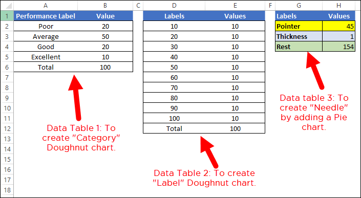
- The first data table is to create the category range for the final SPEEDOMETER which will help you to understand the performance level.
- The second data table is for creating labels ranging from 0 to 100. You can change it if you want to have a different range.
- And in the third data table, we have three values which we will use create the pie chart for the needle. The pointer value is the real value which you want to track.
To create a SPEEDOMETER in Excel, you can use the below steps:
To create a SPEEDOMETER in Excel, you can use the below steps:
- First of all, go to Insert Tab ➜ Charts ➜ Doughnut Chart (with this you’ll get a blank chart).

- Now, right-click on the chart and then click on “Select Data”.

- In the “Select Data” window, click on “Legend Entries” and enter “Category” in the name input bar. After that, select the “Value” column from the first data table.

- Once you click OK, you’ll have a doughnut chart just like below.

- From here the next thing is to change the angle of the chart and for this right click on the chart and then click on “Format Data Series”.
- In “Format Data Series”, enter 270° in “Angle of first slice” and hit enter.

- After this, you need to hide below half of the chart. For this, click on only that part of the chart and open “Format Data Point” and select “No Fill”.

- For the rest of the fours data points, I’ve used fours different colors (Red, Yellow, Blue, and Green). At this point, you’ll have a chart like below and the next thing is to create the second doughnut chart to add labels.

- Now, right-click on the chart and then click on “Select Data”.
- In “Select Data Source” window click on “Add” to enter a new “Legend Entries” and select “Values” column from the second data table.

- Once you click OK, you’ll have a doughnut chart just like below.

- Again you need to hide below half of the chart by using “No Fill” for color and I’ve also added a color scheme for the labels. After this, you’ll have a chart like below. Now, the next thing is to create a pie chart with a third data table to add the needle.

- For this, right-click on the chart and then click on “Select data”.
- In the “Select Data Source” window click on “Add” to enter a new “Legend Entries” and select the “Values” column from the third data table.

- After that, select the chart and go to Chart Tools ➜ Design Tabs ➜ Change Chart Type.

- In “Change Chart Type” window, select pie chart for “Pointer” and click OK.

- At this point, you have a chart like below. Note: If after selecting a pie chart if the angle is not correct (there is a chance) make sure to change it to 270.

- Now, select both of the large data parts of the chart and apply no fill color to them to hide them.
- After this, you’ll only have the small part left in the pie chart which will be our needle for the SPEEDOMETER.

- Next, you need to make this needle bit out from the chart so that it can be identified easily.
- For this, select the needle and right click on it, and then click on “Format Data Point”.
- In “Format Data Point”, go to “Series Options” and add 5% in “Point Exploration”. At his point, you have a ready-to-use SPEEDOMETER (like below), just a final touch is required and that final thing is adding data labels and we need to do this one by one for all three charts.

- First of all, select the category chart and add data labels by Right Click ➜ Add Data Labels ➜ Add Data Labels.
- Now, select the data labels and open “Format Data Label” and after that click on “Values from Cells”.
- From here, select the performance label from the first data table and then untick “Values”.

- After that, select the label chart and do the same with it by adding labels from the second data table.

- And at last, you need to add a custom data label for the needle (That’s the most important part).
- For this, insert a text box and select it, and then in the formula bar enter “=” and select the pointer values cell, hitting ENTER.
- In the end, you need to move all data labels to end corners, like below:

Hurry! your First Gauge/SPEEDOMETER chart is ready to rock.
SPEEDOMETER – Why and Why Not
As I said it’s one of the most controversial charts. You can find a lot of people saying not to use a SPEEDOMETER or a GAUGE chart in your dashboards. I have listed some of the points which can help you to decide when you can this chart and when you need to avoid it.
1. Single Data Point Tracking
As we know, using a SPEEDOMETER can only be relevant (like Customer Satisfaction Rate) when you need to track a single data point. So, if you need to track data (like Sales, Production) where you have more than one point then there is no way for it.
2. Only Current Period Data
This is another important point which you need to take care while choosing a SPEEDOMETER for your dashboard or KPI reports that you can only present current data in it. For example, if you are using it to present customer satisfaction rate then you can only show the current rate.
3. Easy to Understand but Time-Consuming While Creating
As I said, a SPEEDOMETER is a single data point chart so it’s pretty much focused and can be easily understandable by the user. But you need to spend a couple of minutes to create as it’s not there in Excel by default.
download this sample file from here
Conclusion
A SPEEDOMETER or a GAUGE chart is one of the most used charts in KPIs and dashboards. Even then you can find a lot of people who don’t like to use it at all.
But, it’s one of those charts (Advanced Excel Charts) which can help you make your dashboards look cool.
And that’s why I’ve not only shared the steps to create a dashboard but also mentioned those which you need to consider while it in your dashboards. I hope you found it useful, but now, you need to tell me one thing.
Have you ever used a SPEEDOMETER or a GAUGE chart for your dashboard?
Share your views with me in the comment section, I’d love to hear from you and please don’t forget to share this tip with your friends, I’m sure they will appreciate it.
Is it possible to create 2 pointers? One pointing to current state value and another pointer for a future state value?
This was a very helpful tutorial. Is there are way to reverse the scale? I need to display some rate data where smaller is better and boss wants all the gauges to point the same direction, i.e. green on the right for all metrics whether bigger or smaller value is desired.
Fantastic! I’ve tried a few video tutorials and couldn’t make it work. This is great, I appreciate you sharing this.
I’m glad to hear that, Miruna.
Hi Puneet,
I was having trouble with the pointer. It isn’t displaying the value correctly at any number apart from 0/50. 100 is coming around 80. Wanted to know if you knew the reason behind that, or else I could share the file with you to get some assistance.
Thanks
i find it difficult to combine both donut for step 11. hope you can share some tip, on how to combine 3 different chart. the overlapping box make it difficult to edit. or i need more training?
Hi Puneet,
I found this really interesting and have been able to readily use it. One mod I made because a) I was curious about the ‘rest’ value and b) my pointer didn’t land accurately on the value it represented.
Instead of charting the pointer value I convert the value to degrees, then chart that, dynamically changing the Rest value to be 360-Pointer(Degrees)-1(Thickness).
Result:
H2 (Pointer) = User input
H3 = H2/(100/180) <as we want the number of degrees where 0=0 and 100(%) = 180
H4 (Thickness) = 1
H5 (Rest) = 360-(H3+H4)
Finally, the DataSet is H3:H5 and the Textbox value is H2 (so it still shows the original value)
share that file with me, if possible.
puneet(@)excelchamps(.)com
This post is excellent in every way. I truly appreciate your speedometer-related suggestions.
When moving the pointer values, the data is not on top. Is there any fix for this?
I found. Thanks.
Correction B2-200-(B3) saw I hit 100 after I hit the enter button.
Thank you for the tutorial. Very helpful.
At first I was reluctant to engage, but your writing got me hungry enough to eat it; before I knew it, the speedo was made. Thank you.
Tweaking the needle Rest to be an equation helped with the needle placement during the entire sweep.
labels Values
Pointer 75
Thickness 1
Rest =B2-100-(B3)
(Where B2=Pointer and B3=Thickness)
correction B2-200-(B3) saw I hit 100 after I hit the enter button.
Saved my life. Thanks for help!
Very helpful. Still trying to convert the values to large dollars and get the needle to calculate correctly. I know I am overlooking something simple.
The “Rest” value should be twice the maximum value less the value you want to show for the needle. So if you have potential values of between $0 and $5 million, with the pointer at $2 million, then you want the total pie chart value to be $10 million, with the pointer being the first $2 million so “Rest” being $8 million.
Thank you for this excellent tutorial – It helped me a lot!!
Hi I want live data to be connected to my speedometer eg.I want the dat from 0% to 100% if the live data change
0%percentle to 100%
Thanks Puneet
You shift me from Google Sheet to Excel.
Thanks
Thank you for this tutorial, I followed it word for word and it works perfectly
hi Puneet,
This is fantastic! And also great you had attached a working sample so that some of us Excel newbies can use it. 🙂 Only one question though. If I want my range to start from, let’s say 92 and go in the sequence of 92, 93, 94 (in the red zone), 94.5, 95, 95.5, 96, 96.5 (in the yellow zone), 97, 97.5 (in the blue zone) and 100 (in the green zone), how do we adjust the values or formulas in the third table to make sure the pointer points correctly on the gauge? is there a way to do this?
thanks mate! Appreciate you help greatly!
cheers,
Chan
Many Many Thanks for your Excel.
This was great. Def a lot of work to get setup for the first time but once setup I think it can be duplicated easily within the same workbook. Thanks so much for putting this together! Took me a while to figure out that the pie chart cells summed needed equal the sum of the other two tables’ totals. After that, the pointer worked perfectly.
Hello, the needle does not align with the value that is placed in the cell to direct it. How do you resolve this?
Make sure values always adds upp to 200
This is amazing! I was able to pull together my data into a meaningful format and display it in a crisp speedometer that my management likes a lot. Thanks for sharing your knowledge and tricks with others!