When it comes to present data in an understandable way in Excel, charts standout there. And there are few charts which are specific and can be used to present a specific kind of data.
A SPEEDOMETER [Gauge] is one of those charts.
It’s a kind of thing which you can find in your day-to-day life [Just look at the SPEEDOMETER in your car].
And in today’s post, I’m going to show you exactly how to create a SPEEDOMETER in Excel. But here’s the kicker: It’s one of the most controversial charts as well.
So today in this post, we will be exploring it in all the ways so that you can use it in your Excel dashboards when they actually required.
What is an Excel SPEEDOMETER Chart?
An Excel SPEEDOMETER Chart is just like a speedometer with a needle which tells you a number by pointing it out on the gauge and that needle moves when there is a change in the data. It’s a single-point chart which helps you to track a single data point against its target.

Steps to Create a SPEEDOMETER in Excel
Here are the steps to create a SPEEDOMETER [Gauge] in Excel which you need to follow.
As I said, we need to insert two doughnut charts and a pie chart but before you start to create a SPEEDOMETER, you need to arrange data for it.
In the below worksheet, we have three different data tables (two for doughnut charts and one for the pie chart). You can DOWNLOAD it from here to follow along.
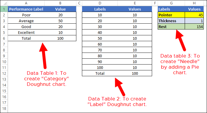
- The first data table is to create the category range for the final SPEEDOMETER which will help you to understand the performance level.
- The second data table is for creating labels ranging from 0 to 100. You can change it if you want to have a different range.
- And in the third data table, we have three values which we will use create the pie chart for the needle. The pointer value is the real value which you want to track.
To create a SPEEDOMETER in Excel, you can use the below steps:
To create a SPEEDOMETER in Excel, you can use the below steps:
- First of all, go to Insert Tab ➜ Charts ➜ Doughnut Chart (with this you’ll get a blank chart).

- Now, right-click on the chart and then click on “Select Data”.

- In the “Select Data” window, click on “Legend Entries” and enter “Category” in the name input bar. After that, select the “Value” column from the first data table.

- Once you click OK, you’ll have a doughnut chart just like below.

- From here the next thing is to change the angle of the chart and for this right click on the chart and then click on “Format Data Series”.
- In “Format Data Series”, enter 270° in “Angle of first slice” and hit enter.

- After this, you need to hide below half of the chart. For this, click on only that part of the chart and open “Format Data Point” and select “No Fill”.

- For the rest of the fours data points, I’ve used fours different colors (Red, Yellow, Blue, and Green). At this point, you’ll have a chart like below and the next thing is to create the second doughnut chart to add labels.

- Now, right-click on the chart and then click on “Select Data”.
- In “Select Data Source” window click on “Add” to enter a new “Legend Entries” and select “Values” column from the second data table.

- Once you click OK, you’ll have a doughnut chart just like below.

- Again you need to hide below half of the chart by using “No Fill” for color and I’ve also added a color scheme for the labels. After this, you’ll have a chart like below. Now, the next thing is to create a pie chart with a third data table to add the needle.

- For this, right-click on the chart and then click on “Select data”.
- In the “Select Data Source” window click on “Add” to enter a new “Legend Entries” and select the “Values” column from the third data table.

- After that, select the chart and go to Chart Tools ➜ Design Tabs ➜ Change Chart Type.

- In “Change Chart Type” window, select pie chart for “Pointer” and click OK.

- At this point, you have a chart like below. Note: If after selecting a pie chart if the angle is not correct (there is a chance) make sure to change it to 270.

- Now, select both of the large data parts of the chart and apply no fill color to them to hide them.
- After this, you’ll only have the small part left in the pie chart which will be our needle for the SPEEDOMETER.

- Next, you need to make this needle bit out from the chart so that it can be identified easily.
- For this, select the needle and right click on it, and then click on “Format Data Point”.
- In “Format Data Point”, go to “Series Options” and add 5% in “Point Exploration”. At his point, you have a ready-to-use SPEEDOMETER (like below), just a final touch is required and that final thing is adding data labels and we need to do this one by one for all three charts.

- First of all, select the category chart and add data labels by Right Click ➜ Add Data Labels ➜ Add Data Labels.
- Now, select the data labels and open “Format Data Label” and after that click on “Values from Cells”.
- From here, select the performance label from the first data table and then untick “Values”.

- After that, select the label chart and do the same with it by adding labels from the second data table.

- And at last, you need to add a custom data label for the needle (That’s the most important part).
- For this, insert a text box and select it, and then in the formula bar enter “=” and select the pointer values cell, hitting ENTER.
- In the end, you need to move all data labels to end corners, like below:

Hurry! your First Gauge/SPEEDOMETER chart is ready to rock.
SPEEDOMETER – Why and Why Not
As I said it’s one of the most controversial charts. You can find a lot of people saying not to use a SPEEDOMETER or a GAUGE chart in your dashboards. I have listed some of the points which can help you to decide when you can this chart and when you need to avoid it.
1. Single Data Point Tracking
As we know, using a SPEEDOMETER can only be relevant (like Customer Satisfaction Rate) when you need to track a single data point. So, if you need to track data (like Sales, Production) where you have more than one point then there is no way for it.
2. Only Current Period Data
This is another important point which you need to take care while choosing a SPEEDOMETER for your dashboard or KPI reports that you can only present current data in it. For example, if you are using it to present customer satisfaction rate then you can only show the current rate.
3. Easy to Understand but Time-Consuming While Creating
As I said, a SPEEDOMETER is a single data point chart so it’s pretty much focused and can be easily understandable by the user. But you need to spend a couple of minutes to create as it’s not there in Excel by default.
download this sample file from here
Conclusion
A SPEEDOMETER or a GAUGE chart is one of the most used charts in KPIs and dashboards. Even then you can find a lot of people who don’t like to use it at all.
But, it’s one of those charts (Advanced Excel Charts) which can help you make your dashboards look cool.
And that’s why I’ve not only shared the steps to create a dashboard but also mentioned those which you need to consider while it in your dashboards. I hope you found it useful, but now, you need to tell me one thing.
Have you ever used a SPEEDOMETER or a GAUGE chart for your dashboard?
Share your views with me in the comment section, I’d love to hear from you and please don’t forget to share this tip with your friends, I’m sure they will appreciate it.
OUTSTANDING article. Just followed along and it came out perfectly. Can’t thank you enough for taking the time to draft this. Excellent work.
Thanks Puneet. Your explanation was awesome and made the process easy. I appreciate you sharing you knowledge. I’m going to check out your other trainings and tips as well. Great work.
Thanks for your words.
i wanna use range from 0-900. so what will be the value of my rest in table 3?
This was really helpful. Thank you!
One idea: Swapping primary and secondary axis on the settings of the chart type dialog ensures that the pointer shows in front of the others areas (pie chart areas need to be 100% transparent). Looks better, I think.
Your genuine effort appreciated but I could not reach Pointer Creation and hence gave up. Btw I was very good at Lotus 1-2-3 including Macros etc.. Excel, beyond a point is almost unusable (for me).
But why so.
This is one of the best explanations of doing a speedometer and believe me – I’ve watched a lot on YouTube. My question is (I’m really not good at Excel), I want the pointer to reflect the “grand total” of my conditional formula that tallies all the “yes’s” the client checked in a box. I got the check box to work but, at the end, I made the donuts. I have categories of Low, Middle, High but want the pointer when they have 26 yes’s answered to reflect that tally and adjust each time. Is that possible?
Could you be able to share a snapshot on puneet-at-excelchamps-dot-com?
Hi Punteet,
This help text is absolutely fantastic thank you so much for taking the time to write it.
I hope its ok but i have a final question on this…
Once I have created the speedometer how can I change the labels at the bottom of the chart back to the performance labels?
Thank you so much for all your work on this!
Best wishe
Emily
Do You mean that “VALUE” label?
Thanks a million Punteet you are awesome.. sharing your efforts for free…
Thank you soo much
You are welcome, Mathew.
Thanks a lot bhai… learned something which i was looking for from long time.
why my needle in at the back of doughnut 1 & 2? did I missed any step?
Thanks so much for this, really helpful. One problem im having is not being able to have seperate data labels for the category & performance graphs, im using Office Proffesional plus 2010 and it doesnt seem to have the option “value from cells”.
Thank you sooo much, Puneet! You made my day… now I can ‘wow’ my colleagues! 🙂
One issue with the sample data I realised: for the Pointer data, the 3 figures need to add up to the same total as the other 2 for the pointer to work properly. In this case 45 + 2 +154 = 201, so when you change 45, it doesn’t always point accurately. All 3 data sets should add up to the same total for the pointer to work well. e.g. 45+2+153 = 200. A difference of 1, makes ALL the difference.
God bless you abundantly Puneet!
thanks a lot Maria. I was not able to understand why my graph was not showing result accurate. after reading your comment i was able to clear the issue.
Even in your example the “45” is located at “55” this is very confusing.
Corrected
I appears that the speedo is not calibrated correctly. I just built one following your instructions. It looks OK with value 45, but at other values it is not correct.
I also when built there is the bottom half of the chart (the white area). How do you eliminate this white space from your Excel dashboard?
Thanks, Peter
Could you be able to share that with me?
Thanks so much, a good piece explained very well. Really appreciate
Your welcome, Priyanshu.
amazing
very useful
I’m glad you found this useful, Ary.
Yes, I have used them. One set of three with their individual goals also shown helped the team to more focused and better assess the tasks needed to make the ‘needles’ for the different tasks move in the right direction. After 6 months of weekly reports and discussions, the goals were reached.
is there a way to add a second ponter? I’ve tried but I can’t seem to get it to show.
The best way is to use VBA and shapes. Search YouTube for some really cool ideas. It doesn’t take a lot of VBA skill to get it done!