What is a Slicer?
A Slicer in Power BI is a visual filter that filters data in reports and dashboards. Slicer offers a more interactive experience than traditional filtering methods, as they are added directly onto the report canvas and can be formatted and customized to fit the report’s design.
Types of Slicers to use in Power BI
Here’s a list of the different types of slicers available in Power BI:
- List Slicer – Displays options in a vertical list.
- Dropdown Slicer – Consolidates the slicer into a dropdown list, saving space on your report.
- Button Slicer – Turns each filter option into a clickable button.
- Horizontal Slicer – Displays options horizontally rather than the traditional vertical list.
- Date Slicer – Specifically designed for filtering date fields.
- Relative Date Slicer – A specialized version of the Date slicer focused on relative date filtering.
- Range Slicer – Allows users to select a range of values, typically numerical data.
- Hierarchy Slicer – Enables drilling down through hierarchical data within the slicer, such as geographical data (Country > State > City) or organizational structures.
Insert Slicer in Power BI
To start, open your Power BI report and identify the page where you would like to add the slicer:
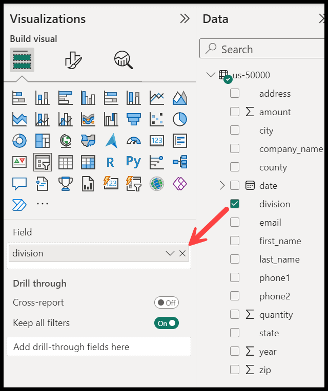
- Go to the Visualizations Pane and choose the Slicer Icon: On the right side, you’ll find the Visualizations pane. Click on the slicer icon to select it. This will insert a new slicer visualization on your report canvas.

- Add Data to Your Slicer: Go to the Fields pane (also on the right side). Here, you’ll see a list of tables and fields from your data model. Drag the field you want to use to filter into the Values area of the slicer visualization.
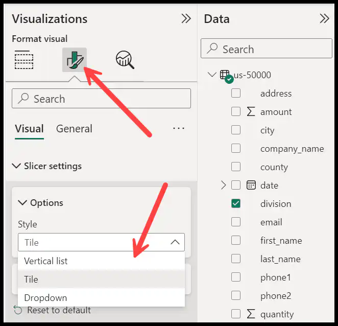
- Customize Your Slicer: By default, the slicer will display as a list. You can change it to a dropdown, date range, or numeric range slicer by selecting the slicer and then using the options under the Format pane.
- Use Your Slicer: To filter your report based on the slicer, click on one or more items within the slicer. The rest of the report’s visualizations will be updated to reflect the data filtered by your selection.
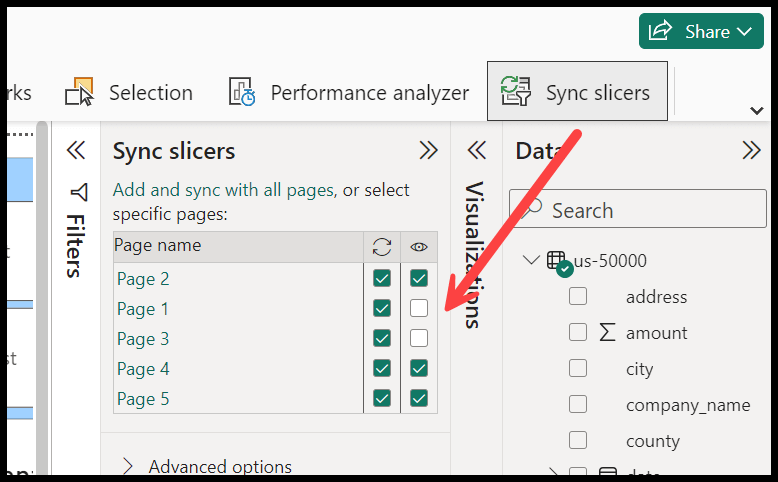
Synchronizing Slicers Between Report Pages
You can synchronize slicers between report pages. This way, when a user applies a filter on one page, the same filter will automatically apply to all synchronized pages.
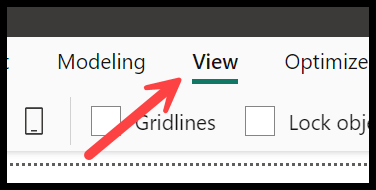
- Open the View tab: Go to the Power BI toolbar at the top of the page and click on the “View” tab.
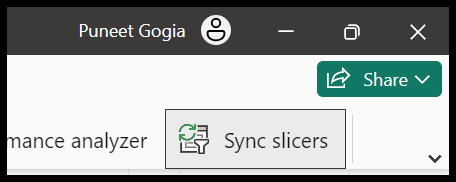
- Enable Sync Slicers pane: From the View tab, select the “Sync slicers” option to enable the Sync slicers pane on the right side of the screen.
- Choose pages to sync: In the Sync slicers pane, you’ll see a list of all report pages. Check the boxes next to the pages where you want the selected slicer to apply. There are two ways to use this option. One is to use the sync slicer to multiple or all the page and second is to show the same slicer to multiple or all the pages.
Date Range Slicer in Power BI
The Date Range Slicer in Power BI is designed to filter data within a report based on a range of dates. This slicer helps filter sales performance over time, project timelines, or any scenario where you need to explore data over specific periods.

When you enter a new slicer and then add dates to the data field, Power BI automatically creates a date filter. And if somehow you edit a pre-defined slicer, in that case, you need to change the Slicer style to “Between” from the formatting options.
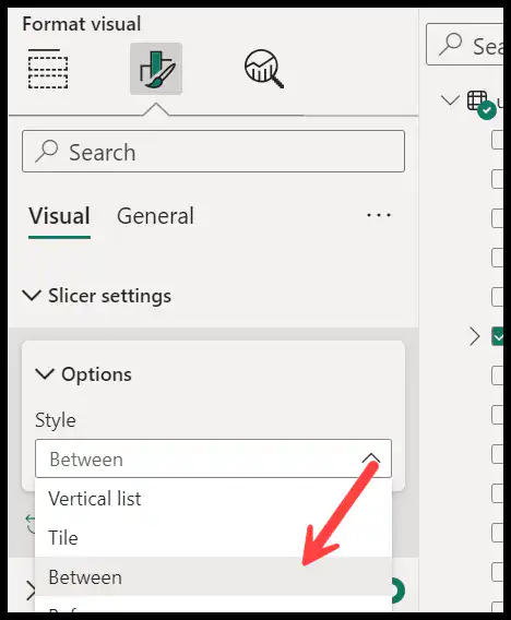
In the date filter you have option to create a date range for the filter using the bar. And there one more style of the date slicer which you can use.
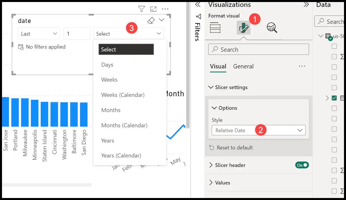
With the relative date filter, you can use pre-defined filter options to use.
Formatting a Power BI Slicer
Once a slicer is added to a Power BI report, you can customize its appearance.
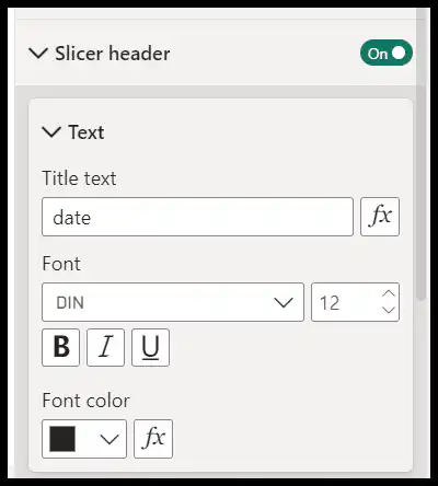
- Slicer header: In the “Slicer header” section, you can customize the slicer’s title, font color, background color, and text size.
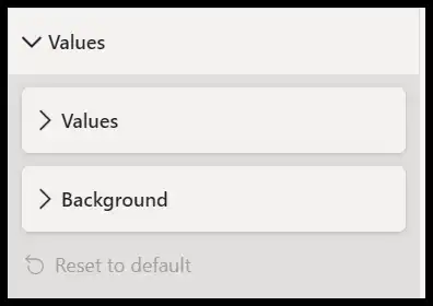
- Values: The “Values” section lets you control the appearance of the slicer’s options. You can adjust font color, text size, and background color.
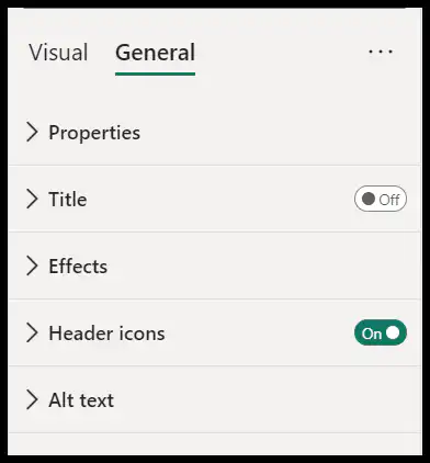
- General Settings: This allows you to customize your slicer with effects like background color, border, and shadow. You can also add a title to the slicer and then customize it.
Choosing the Right Slicer
The choice of slicer depends on the nature of the data being filtered and the user’s interaction preference. For instance, a Date slicer is essential for reports requiring date range selections. A Range slicer is ideal for numerical datasets where users need to filter between specific values. The Button and Horizontal slicers offer aesthetic and space-saving benefits that can enhance the report’s user interface.
Tips for using Slicer in Power BI
- Leverage the Search Option in Slicers: Enable the search box feature for slicers with a long list of items. This will make it easier for users to find and select specific items, improving the slicer’s usability.
- Sync Slicers Across Pages – If you have a report with multiple pages, consider synchronizing slicers across these pages for a consistent filtering experience.
- Limit the Number of Slicers – While slicers are useful, having too many on a report page can overwhelm users and clutter the interface.
- Customize Slicer Appearance – Customize the appearance of your slicers to match your report’s theme and to make them more engaging. Consider font sizes, colors, and the number of items to display.
Limitations of Power BI Slicer
- Performance Issues: Slicers can slow down the performance of your reports, especially when dealing with large datasets. Each slicer added to a report sends additional queries to the data model, increasing the load and potentially slowing down response times.
- Limited Visual Space: Slicers take up visual space in your report. If you use too many slicers, your report can become cluttered, making it less user-friendly and harder to navigate.