


A Population Pyramid chart is a specific chart that helps us to present and analyze the population of both genders using age groups.
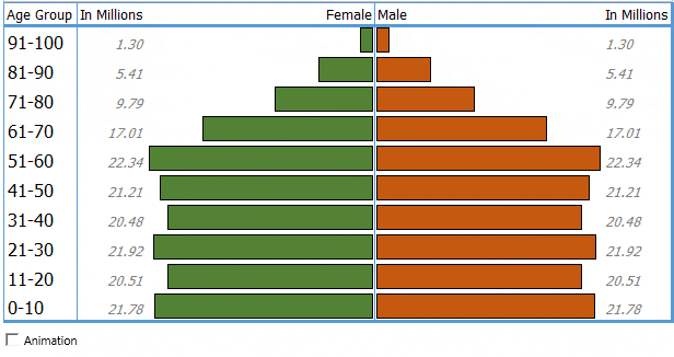
A population pyramid also called an age pyramid or age picture is a graphical illustration that shows the distribution of various age groups in a population, which forms the shape of a pyramid when the population is growing.In Excel, we can create population pyramid chart using a bar chart, just like below one.
Wikipedia
Insert a bar chart and then do a bit of customization, that’s it.
But here is the twist. I have found that apart from this traditional method we can also use two different methods as well. And today in this post, I’d like to share these three methods [exact steps] with you. So let’s get started.
Simple Steps to Create a Population Pyramid Chart Using Bar Chart
Before we create this chart we need to prepare data. A table with the total population, the female population in negative values, and the male population in positive values.


Note: A column for the total population is not compulsory but make sure to have a female population in negative.
- First of all, we need to insert a bar chart. For this, select age group, female and male data columns and insert a bar chart from Insert Tab ➜ Charts ➜ 2D Bar ➜ Clustered Bar.
- Now we have a chart like below and further, we need to do some customization in it to make a population pyramid.

- From here, we need to make vertical axis in reverse order and from this, go to Format Axis ➜ Axis Options ➜ Axis Position ➜ tick mark “Category in Reverse Order”.

- After that, go to Format Axis ➜ Axis Options ➜ Labels ➜ change label position to “Low”.

- Next, we need to change series overlap to 100% and gap width to 0%. For this, go to Format Axis ➜ Series Option.

- In the end, we need to convert negative data labels for female data bar into positive. For this, select data labels and go to Format Data Labels ➜ Label Options ➜ Number select custom from category and add to the “#,##0.00;#,##0.00” format.


Congratulations! Our pyramid chart is ready to rock.


Use Conditional Formatting to Simple Create a Pyramid Chart in Excel
We can also create a pyramid chart by using conditional formatting and here are the steps for this.
- First of all, create a table with male and female population data with age groups.

- And then, select a single column either male or female and apply conditional formatting data bars from Home Tab ➜ Styles ➜ Data Bars ➜ More Rules.
- After that, in the new formatting dialog box, tick mark the “Show Bar Only”, add solid border and change bar direction (female and male bars should be in opposite direction).

- Now, select the second data column and add data bars to it in the same the way, and you’ll get a pyramid chart like below.

- In the end, for a final touch, add two column at both sides of the diagram to add data labels.


Boom! Our chart is ready.


Create an In-Cell Population Pyramid Chart in Excel
I am a big fan of REPT and the best thing is you can use it to create a simple population pyramid.
- First of all, create a table like below.

- Now, add the below formula in female and male columns and drag it down.
Female Column: =IFERROR(REPT(“|”,C5*4),””)
Male Column: =IFERROR(REPT(“|”,F5*4),””)
- After that, change the font style to Playbill (Font Size – 10) or you can also use Stencil (Font Size – 10).
- In the end, change the font color for both the columns and make female column’s alignment to right and male’s to left.

The chart is ready.


Sample File
Download this sample file from here
Conclusion
You might be wondering that a pyramid chart is just for population data but the truth is you can use it for all kinds of data.
Whenever you need to compare different data points for two different time periods pyramid chart is best to use, for example, sales data for different products for two years.
It’s one of my lists of advanced Excel charts and graphs. I hope you found this tip useful, but do tell me one thing.
Have you ever used a pyramid chart? Or, do you have any other way to create it?
Share your views with me in the comment section, I’d love to hear from you. And, please don’t forget to share this tip with your friends.